HIGHLIGHT:
Cinder Block Brewery
The Background
In early 2023, I was contacted by a friend who worked in sales at Cinder Block Brewery in North Kansas City. The brewery had an in-house graphic designer who was moving away and they were on the hunt for some interim help with various design needs. That list included apparel, signage, website graphics and what I was most excited about – beer labels.
At this point I was about a year removed from the end of my tenure at Boulevard Brewing Company, and I was eager to do work in the beer space again. But even more so, I was looking forward to working on designing labels because Boulevard had a dedicated team of designers for that work and it was never something I had dabbled in.
What started as something I thought would be a brief job turned into 6+ months of design work that I’m super proud of, particularly the labels below!
Championship Drip
My first assignment for Cinder Block Brewery was a beer label for Championship Drip, their Cold India Pale Ale celebrating the Kansas City Chiefs’ 2023 Super Bowl victory against the Philadelphia Eagles.
In planning this concept, there were some established brand criteria I needed to adhere to in order to stay consistent with prior labels:
1) The Cinder Block bowtie logo should be prominent and centered on the label
2) The space on the right is typically reserved for some type of cinder block icon. This tended to vary stylistically depending on the beer, so there was some freedom in how I could represent it.
3) The space on the left is typically reserved for three descriptor words highlighting the beer’s flavor, ingredients, etc.
When I first heard the word Drip as part of this beer’s name, my mind immediately went to graffiti and dripping paint. I dove immediately into creating the graffiti-style arrowhead and lettering, and then worked around that centerpiece to fill in the rest of the label.
Utilizing a jersey-style mesh pattern, accompanying stripes, and athletic font for other text elements felt like a great way to add uniformity (pun very intended) while naturally incorporating Chiefs colors. And because I’m a little extra, I went beyond the label and created a fun animation for the brewery to use while promoting the beer on social media channels.
Imperial Pumpkin Latte
The next label project I dove into for Cinder Block was an Imperial Pumpkin Latte that they had planned for the fall of 2023. Now, at first it felt a little strange to be designing pumpkin beer art in June, but seasonal beer creep is real and fortunately, I’m a Halloween-loving fella.
I wanted to get weird with this one. Not TOO weird, but weird enough to match the energy and absurdity of the Halloween season and something fitting for a pumpkin coffee beer.
Enter: the headless horseman barista.
If Championship Drip was a safe screen pass, Imperial Pumpkin Latte was a 60-yard heave towards the end zone – a bit risky, but it was worth the payoff. I loved the idea of having the label serve as a coffee shop counter, with a disembodied Jack-O-Lantern calling out the beer name as an order. Using the cinder block as a mug holder and a chalkboard for the descriptor words felt like a must, and filling in the details was just froth on the latte.
Imperial Pumpkin Latte ended up only going on draft at bars and restaurants around town (in beer, these things happen sometimes), so this label didn’t get its full opportunity to shine, but that headless barista still got to make some appearances on tap handle stickers throughout Kansas City.
Doppel Block
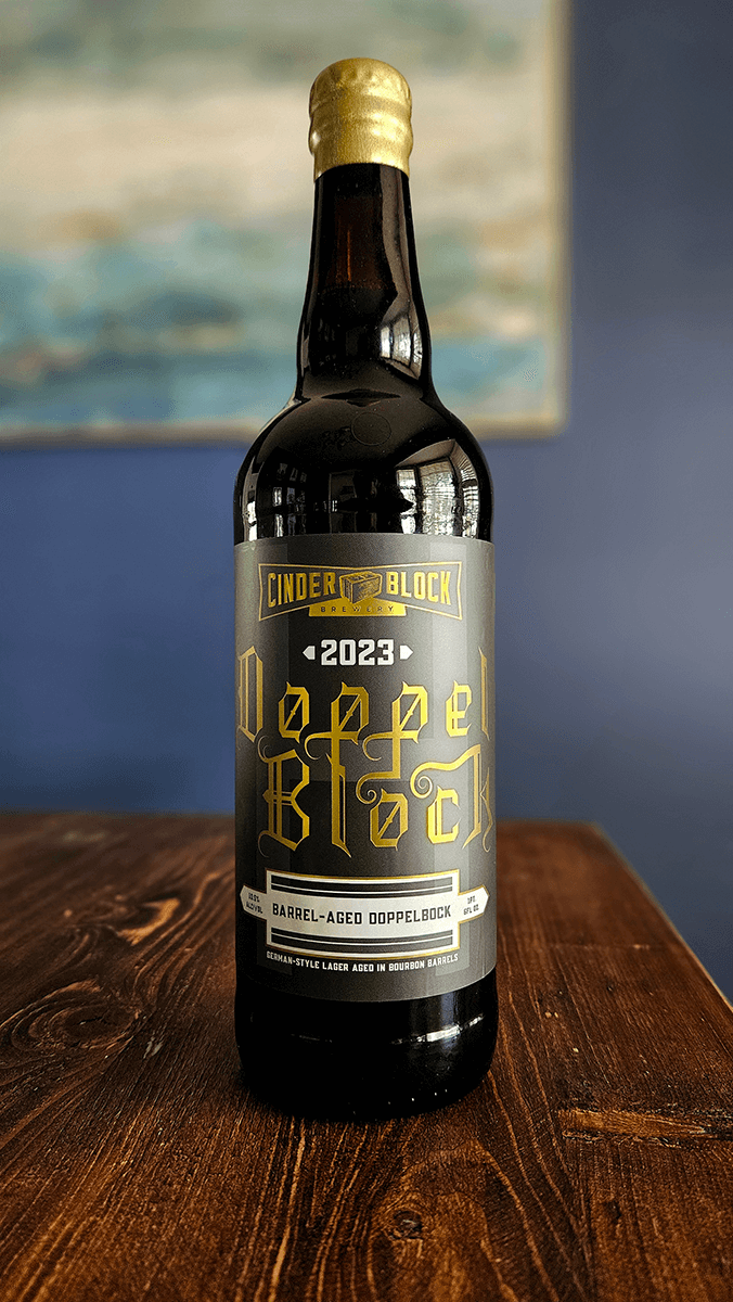
Doppel Block was a barrel-aged Doppelbock style beer made by Cinder Block to commemorate their 10th anniversary. This particular label would end up deviating from my prior two designs, as it was going to be used on a 750ml bottle instead of a can. The typical structure was going to be broken up a bit, and I was looking forward to the challenge of creating something that celebrated Cinder Block while doing justice to the beer’s history.
With Doppelbock being a German style of beer, I was quickly inspired by calligraphic, Fraktur-style lettering that is often considered the ‘German typeface’. And this lettering was truly a labor of love. Every single one of those letters in ‘Doppel Block’ was painstakingly (that’s such a dramatic word, there was no pain involved) created by hand. I didn’t want this to just be a slightly repurposed font – I wanted it to be genuinely original with its own unique stylings while still paying tribute to the centuries-old German lettering.
Dark, moody grays allude to the beer’s time resting away in a barrel, while gold foil accents throughout elevate it, giving it a limited edition feel. Próst!
Hop Maven Returns
I personally couldn’t have asked for a better way than Hop Maven Returns to wrap up my time designing labels for the folks at Cinder Block. As a longtime follower of theirs, I knew they had released many iterations of Hop Maven IPA over time, and each release was accompanied by a playful, cinematic video on social media that typically played off elements from mystery, thriller, and action movies.
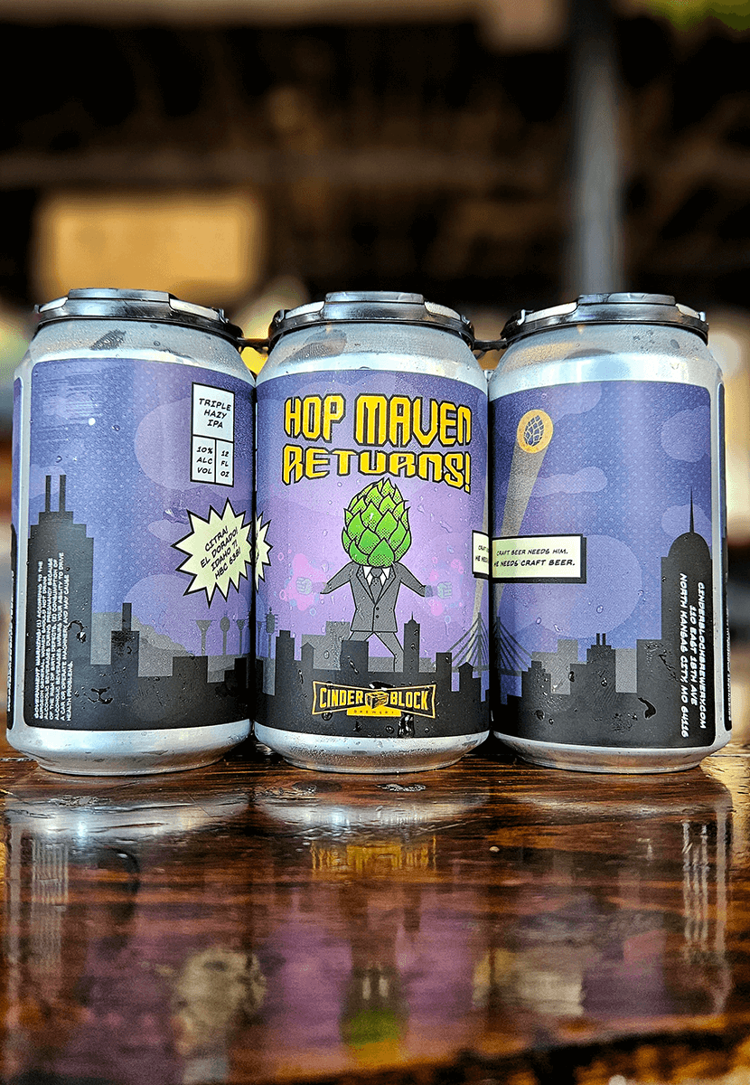
With Hop Maven Returns, they were really wanting to go for a superhero/comic book feel for the label, and the massive nerd inside me rejoiced.
For this artwork, I understood the assignment and went full comic book cover in my approach. With some kind of craft beer kaiju vision in my head, I drew out an anthropomorphic hop cone towering over Kansas City with notable local landmarks incorporated into the silhouette. Looks a little menacing at first but ah, yes, there’s the Hop Signal. This thing was summoned here. It’s a good guy. We’re cool!
The rest were simple touches to bring it all together as a comic cover. A background dot pattern serves as a nod to the halftones you’d see in retro and vintage comics. A starburst excitedly shouts the hops contained within the beer, while a narration box communicates our hero’s tagline.
