HIGHLIGHT:
The 3929 Foundation
The Background
In January of 2025, my friend and former colleague Jackson Layton was diagnosed with stage 4 colon cancer at just 28 years of age. It was shocking and devastating news, but it didn’t deter Jackson from taking his battle and using it as a catalyst for positive change and helping others.
Out of his diagnosis, The 3929 Foundation was born with a goal of providing financial assistance to those who are battling cancer and raise awareness of the rising rates of colon cancer and other cancers in young adults.
The Request
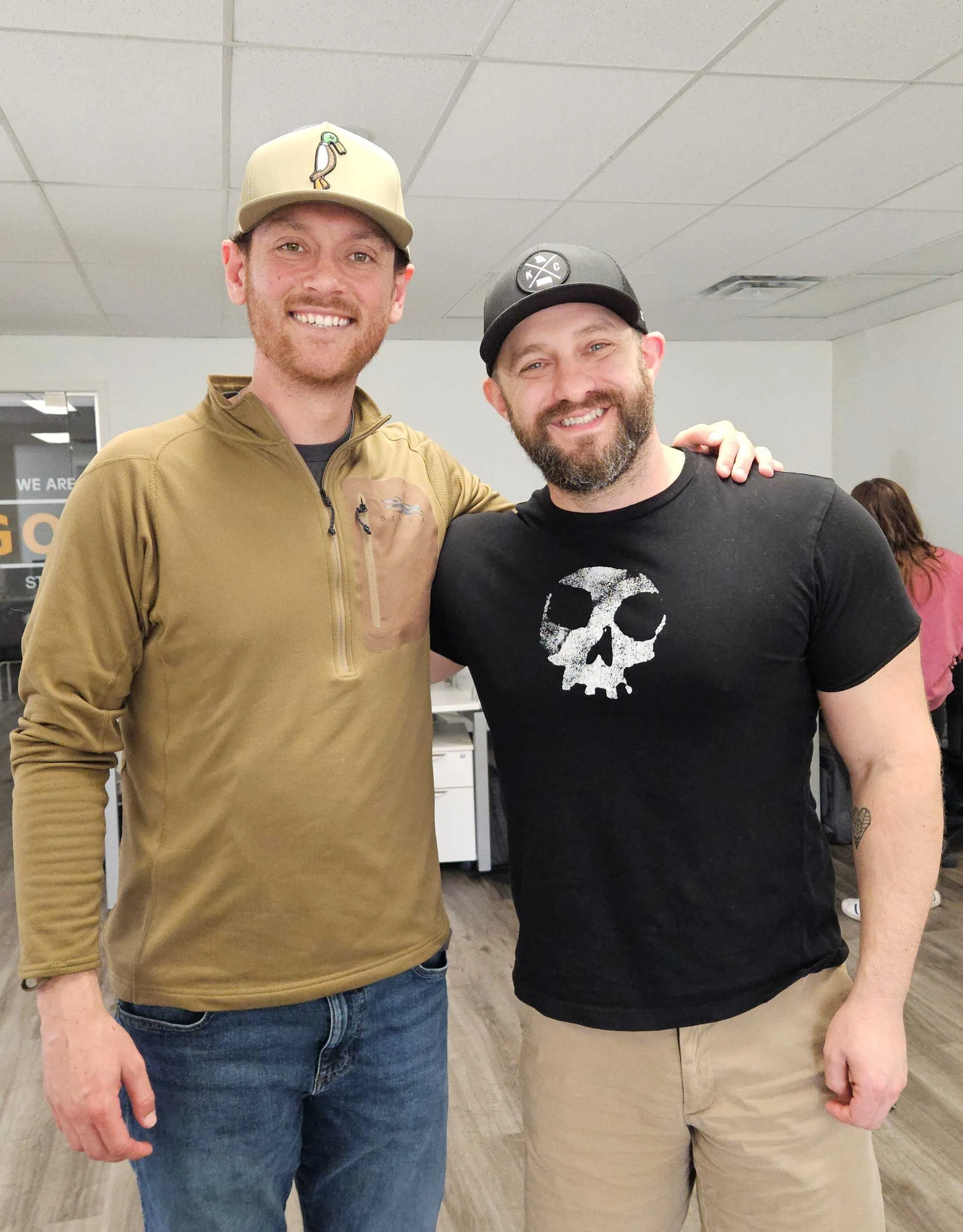
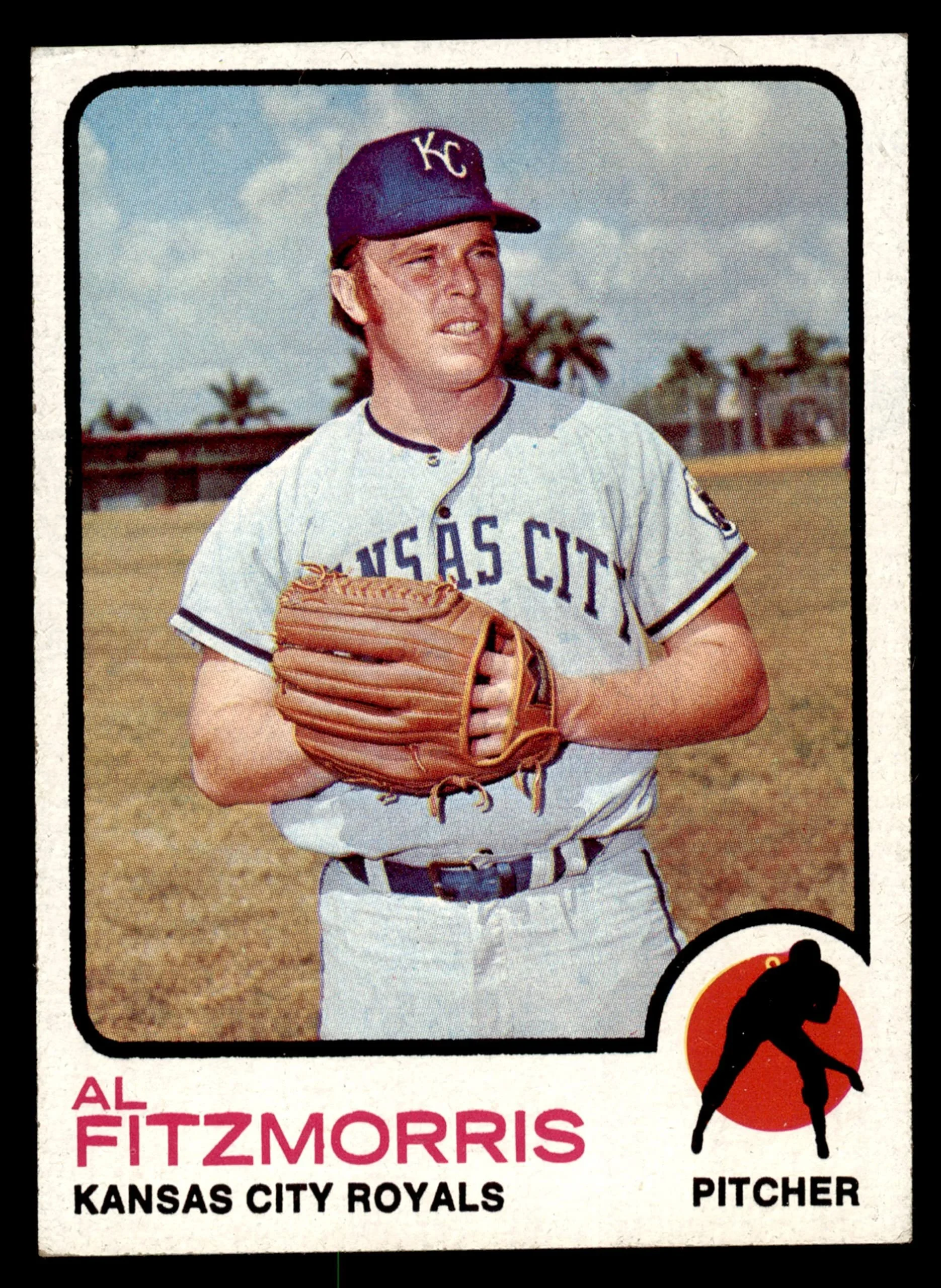
Jackson reached out to me and told me about his plan for The 3929 Foundation. The organization was created in partnership with Matt Fitzmorris, whose father (and former Kansas City Royals player) Al Fitzmorris passed away from cancer in December 2024.
So why 3929?
It’s simple, really – Al Fitzmorris wore the number 39 on his jersey when he played baseball, and Jackson wore number 29.
When Jackson proceeded to ask if I would be willing to design a logo for The 3929 Foundation, I was honored and immediately said yes. Over the past few years, I had watched my own stepson go through treatment for Hodgkin Lymphoma, and lost my mom to liver cancer.
Jackson and Al’s shared passion for baseball and mutual fight against cancer drove Jackson’s vision of the non-profit’s branding. His asks of me were simple: make sure the logo has some allusions to baseball (particularly a crown in reference to the Royals), a cancer ribbon, and include the color blue. Challenge accepted.

The Inspiration
It’s hard not to think about baseball and Kansas City without thinking about the Negro Leagues. With the Negro Leagues Baseball Museum nestled right here at 18th and Vine, we’re fortunate to be the home for a place that preserves its rich history and legacy.
I’ve always been particularly fond of the various badges and logos that Negro Leagues and its associated teams used. There’s a reason that many are still re-printed, replicated and used as inspiration for team logos today. They are unabashedly and proudly representative of baseball, while implementing unique typography and circular or diamond shapes.
I drew from these elements as I dove into concepts for The 3929 Foundation, and it all fell into place perfectly.
The Results
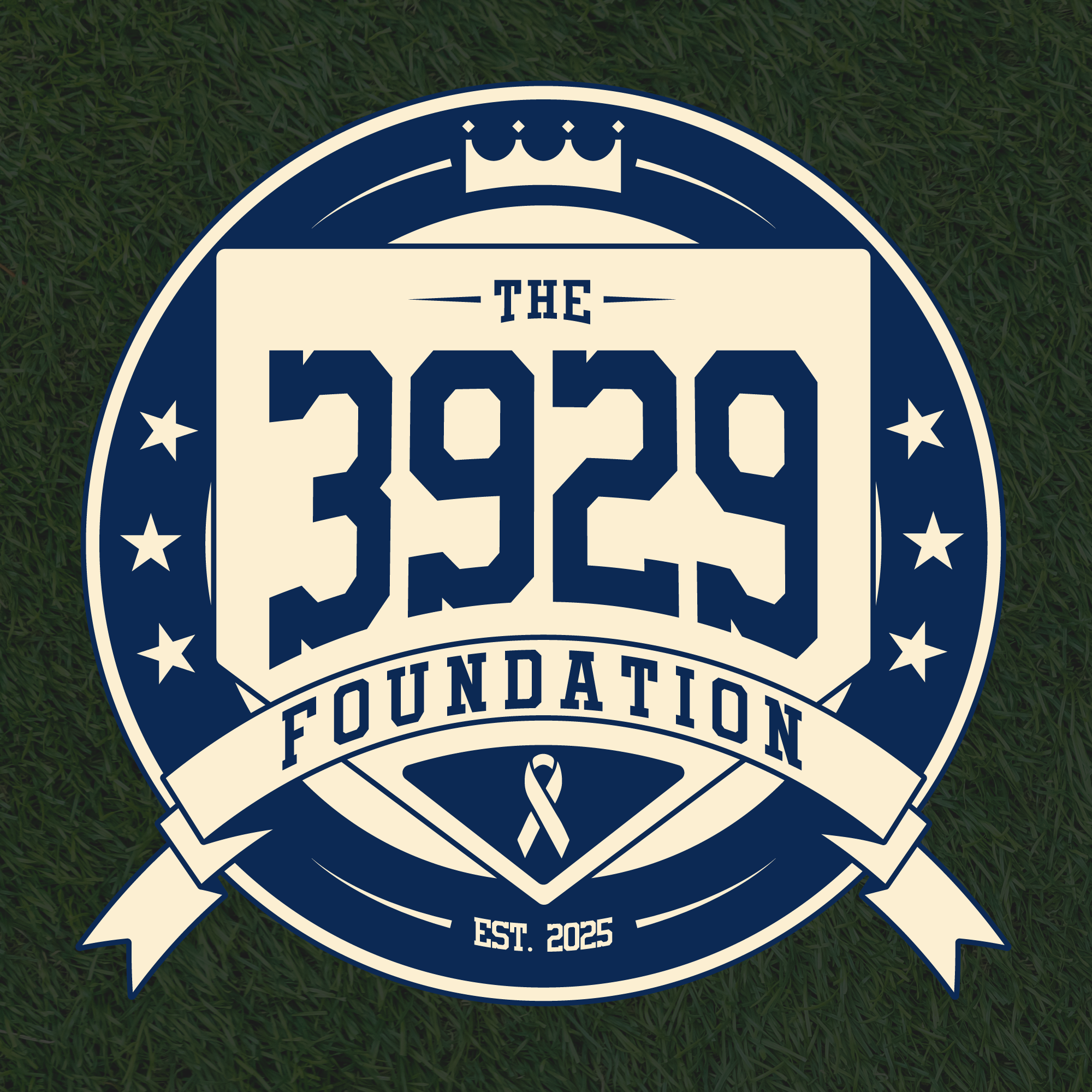
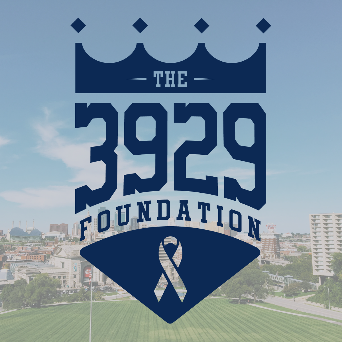
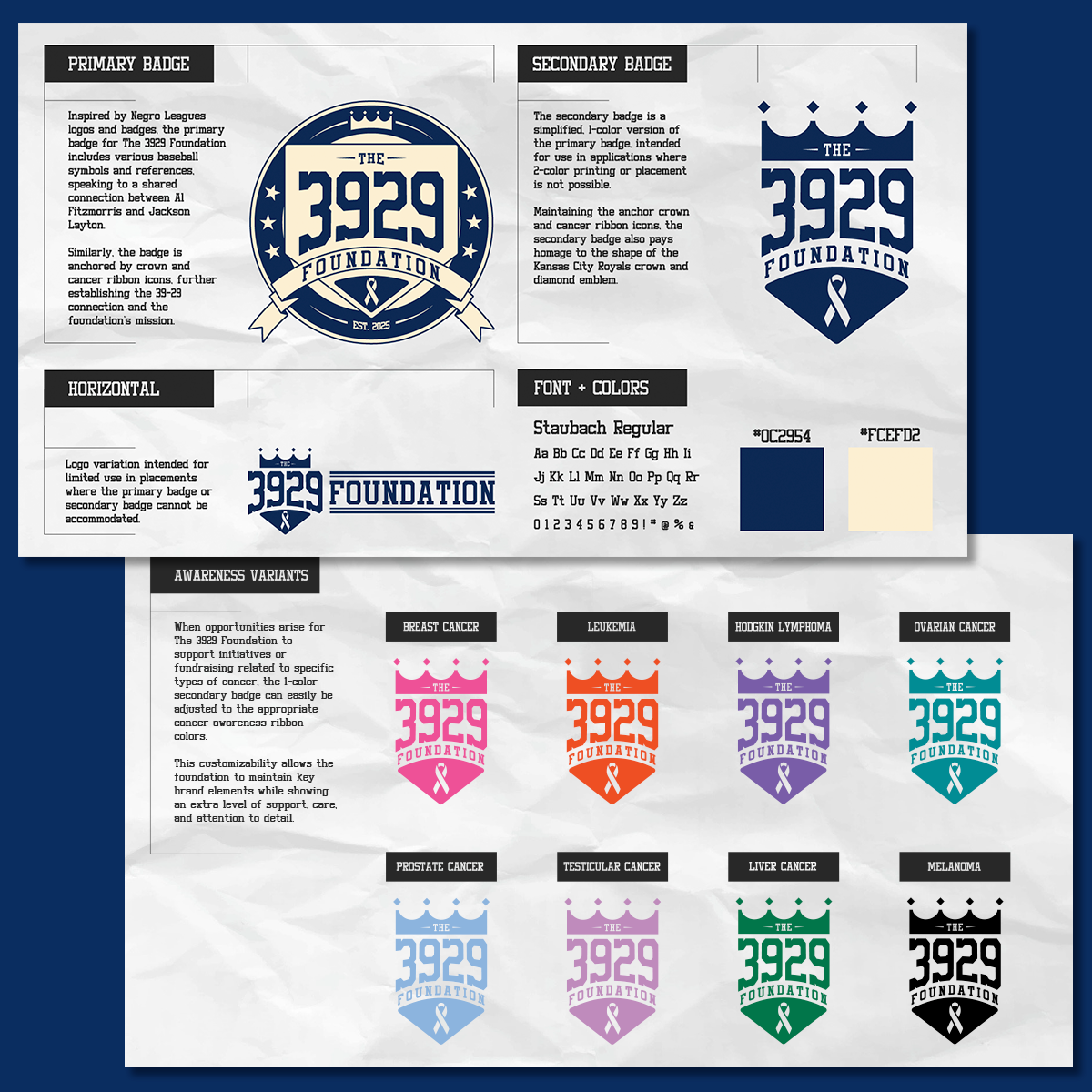
Jackson may have just asked me for a logo, but I decided to take things many steps further and create an entire branding mechanism for The 3929 Foundation. This included an entire logo suite with a 2-color primary badge, a 1-color secondary badge, and a 1-color horizontal variation.
Dark blue was used for the main color as a nod to the color of the colon cancer awareness ribbon, in acknowledgement of Jackson’s fight. On the primary badge, I complemented the blue with an off-white cream color that felt reminiscent of throwback baseball uniforms or a home plate that had seen 9 innings worth of heavy action. The primary badge’s circular shape accented with stars and a ribbon banner give it that vintage baseball emblem feel while, of course, adorning everything with a crown to represent Kansas City.
Along with the logo suite, I developed an initial brand guide for The 3929 Foundation, that outlined logo descriptions and uses, brand fonts and colors, examples of how the secondary badge could be used for Awareness campaigns for different cancer types, and even examples of the artwork being used on merch and apparel.